
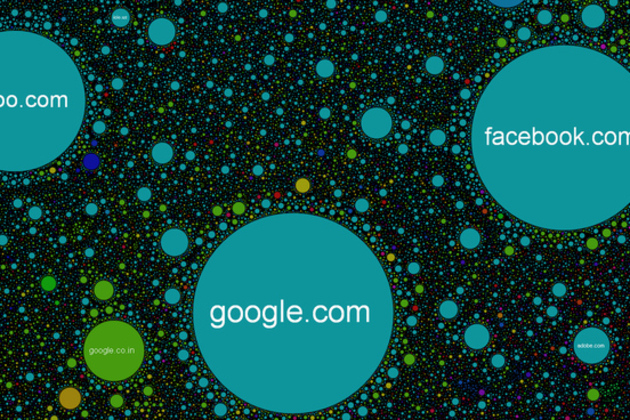
Imagine the web as a giant galaxy where the planets are sites clustered together by likeness, and what you might get is something like The Internet Map. Representing over 350,000 websites from 196 countries and all domain zones at the end of 2011, the map displays over 2 million site links based on topical similarities. Each site is represented by a circle, with size depending on the amount of traffic, and the space between each is determined by frequency, or strength, of the link created when user's jump from one website to another. If you want to get into the fine details of how the map's layout is calculated, the group behind the project has provided a few very technical mathematical and engineering resources. Feel free to move around...
from The Verge - All Posts http://www.theverge.com/